
Templates
domotion template <name> is the fastest way to a polished animated SVG without
writing any HTML. Pick a built-in, pass a few flags, and Domotion drives its
capture → compose pipeline to emit one self-contained, infinitely-replayable SVG.
domotion template <name> [--flag value …] -o out.svgdomotion template list— show the built-in templates.domotion template --help— the verb’s shared options (output, optimize,.svgz).domotion template <name> --help— a template’s own parameters.
Pass scalar params as --flags. Arrays (chart --data, palette --colors,
--labels) accept a comma-separated string; anything nested can also go through
--params '<json>' or --params-file <file.json>.
Every example below is a real invocation — the command shown is exactly what produced the SVG above it.
New here and want end-to-end creative recipes (a 9:16 teaser, a testimonial card, a kinetic title over a captured screen, a storyboard) rather than the per-template reference? See the Recipe gallery.
There are 14 built-ins. Beyond the ones walked through below, the
creative-template pack adds full-bleed text/number cards — title-card
(intro title), quote (pull-quote), caption (lower caption overlay),
cta (end-card with a pulsing button), counter (count-up/down/timer on an
odometer digit-reel), stat (KPI + trend chip), and compare (before/after
clip-wipe). Every template also adapts to a --format social preset (reel /
square / portrait / landscape — the type scales to fit) and a --brand <file.json>
kit (palette / type / logo defaults). See the Recipe gallery
for these in action.
Charts
Section titled “Charts”Turn a list of numbers into an animated column / bar / line / pie /
donut chart — bars grow from the axis, the line draws in, slices sweep into
place. Single-series column/bar charts default to one neutral color with the
standout bar in the accent; multi-series and pie/donut use distinct colors that
genuinely encode the series or slice. Override with --colors any time.
Column — vertical bars that grow up from the baseline.

domotion template chart --type column \ --data "42,68,55,90,34,76" --labels "Jan,Feb,Mar,Apr,May,Jun" \ --title "Monthly signups" --width 1100 --height 640 -o chart-column.svgBar — horizontal bars with the labels on the left.

domotion template chart --type bar \ --data "120,88,64,40" --labels "Search,Direct,Social,Email" \ --title "Traffic by source" --width 1100 --height 560 -o chart-bar.svgLine — a polyline that draws in left-to-right with popping points.

domotion template chart --type line \ --data "12,18,15,28,24,38,44" --labels "Mon,Tue,Wed,Thu,Fri,Sat,Sun" \ --title "Daily active users" --width 1100 --height 600 -o chart-line.svgGrouped — multiple series side-by-side with a legend. Separate series with
; in --data.

domotion template chart --type column --layout grouped \ --data "42,68,55;30,52,71" --labels "Q1,Q2,Q3" \ --seriesNames "2024,2025" --title "Revenue by quarter" \ --width 1100 --height 620 -o chart-grouped.svgStacked — series stacked into one bar per category.

domotion template chart --type column --layout stacked \ --data "20,35,30,28;15,25,40,22;10,15,20,30" --labels "Mon,Tue,Wed,Thu" \ --seriesNames "Email,Social,Direct" --title "Traffic by channel" \ --width 1100 --height 620 -o chart-stacked.svgDonut — a ring whose slices sweep in, with a label + percentage legend.

domotion template chart --type donut \ --data "42,28,18,12" --labels "Search,Direct,Social,Email" \ --title "Traffic sources" --width 1100 --height 620 -o chart-donut.svgKinetic text
Section titled “Kinetic text”Reveal a headline word-by-word (--by word, the default) or character-by-character
(--by char) with a staggered one-shot animation. Choose the reveal style with
--variant: rise, slide, fade, clip (a left-to-right wipe), or pop
(a center-origin scale-up with overshoot).
Rise — words lift into place (the default).

domotion template kinetic-text --text "Ship faster with Domotion" \ --variant rise --width 1280 --height 720 -o kinetic-text-rise.svgFade — words fade up softly.

domotion template kinetic-text --text "Designed in the browser" \ --variant fade --width 1280 --height 720 -o kinetic-text-fade.svgClip — a left-to-right wipe reveals the headline.

domotion template kinetic-text --text "Wipe to reveal" \ --variant clip --width 1280 --height 720 -o kinetic-text-clip.svgSlide (per character) — letters slide in from the left.

domotion template kinetic-text --text "MOTION" \ --variant slide --by char --fontSize 160 \ --width 1280 --height 720 -o kinetic-text-slide-char.svgPop (per character) — letters scale up from their center with an overshoot.

domotion template kinetic-text --text "POP!" \ --variant pop --by char --fontSize 200 \ --width 1280 --height 720 -o kinetic-text-pop.svgMulti-line + emphasis — \n breaks lines; a safelisted set of inline tags
(<b>, <i>, <u>, <font color>, …) styles individual words.

domotion template kinetic-text \ --text 'Build <font color="#22d3ee">motion</font>\nright in the <i>browser</i>' \ --variant rise --width 1280 --height 720 -o kinetic-text-emphasis.svgDevice mockups
Section titled “Device mockups”Wrap a captured page in a phone, browser, or window bezel. Point --input at a
local file or URL and pick a --device; --label sets the address-bar / title-bar
text. (The examples below frame a small sample app — swap in your own page.)
Phone — a mobile bezel; --mobile captures at a phone viewport.
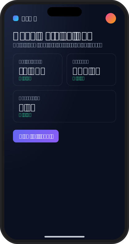
domotion template device-mockup --input ./app.html \ --device phone --mobile --width 390 --height 760 -o device-mockup-phone.svgBrowser — a browser chrome with an address bar.
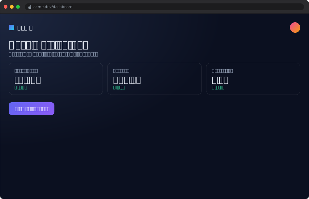
domotion template device-mockup --input ./app.html \ --device browser --label "acme.dev/dashboard" \ --width 1000 --height 600 -o device-mockup-browser.svgWindow — a desktop app window with a title bar.
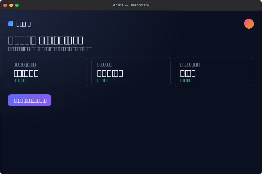
domotion template device-mockup --input ./app.html \ --device window --label "Acme — Dashboard" \ --width 900 --height 560 -o device-mockup-window.svgBackground loops
Section titled “Background loops”Procedural, seamlessly-looping animated backgrounds. Choose a --variant, tune
the --colors palette, and set a --seed for reproducible layout (same seed,
identical output).
Aurora — large soft mesh-gradient blobs that drift and breathe.

domotion template background-loop --variant aurora \ --seed 4 --width 1280 --height 720 -o background-loop-aurora.svgOrbs — smaller, more opaque floating circles.

domotion template background-loop --variant orbs \ --colors "#f43f5e,#fb923c,#facc15" --count 7 --seed 2 \ --width 1280 --height 720 -o background-loop-orbs.svgStars — a twinkling night-sky field that sparkles on its own clock.

domotion template background-loop --variant stars \ --colors "#ffffff,#bcd2ff,#a5b4fc,#fde68a" --background "#05060f" --seed 5 \ --width 1280 --height 720 -o background-loop-stars.svgGradient pan — a color wash that pans continuously in one direction.

domotion template background-loop --variant gradient-pan \ --colors "#6366f1,#ec4899,#22d3ee,#f59e0b" \ --width 1280 --height 720 -o background-loop-gradient-pan.svgGrid — a dot grid that drifts seamlessly by exactly one cell.

domotion template background-loop --variant grid \ --colors "#6366f1,#ec4899,#22d3ee,#f59e0b" \ --width 1280 --height 720 -o background-loop-grid.svgWave — layered parallax sine-wave ribbons.

domotion template background-loop --variant wave \ --colors "#1e3a8a,#0e7490,#0891b2,#22d3ee,#67e8f9" --background "#041020" --seed 7 \ --width 1280 --height 720 -o background-loop-wave.svgLower-thirds & social
Section titled “Lower-thirds & social”Broadcast-style banners and social cards that slide, pop, and pulse into place.
lower-third is a title/subtitle banner; subscribe is a follow/subscribe
pop-up with a pulsing call-to-action; chat is a message thread whose bubbles
pop in one at a time.
Lower-third (dark) — a banner that slides and fades in.

domotion template lower-third --title "Ada Lovelace" \ --subtitle "First Programmer · 1843" --accent "#22d3ee" \ --theme dark --position bottom-left \ --background "linear-gradient(135deg, #1e293b, #0f172a)" \ -o lower-third-dark.svgLower-third (light) — same banner, light theme, opposite corner.

domotion template lower-third --title "Live from London" \ --subtitle "Acme News Network" --accent "#ef4444" \ --theme light --position bottom-right \ --background "linear-gradient(135deg, #e2e8f0, #cbd5e1)" \ -o lower-third-light.svgSubscribe — a YouTube-style pop-up with a pulsing CTA and a simulated click.

domotion template subscribe --name "Domotion" \ --subtitle "1.2M subscribers" --action Subscribe --accent "#ff0000" \ --width 760 --height 360 -o subscribe-youtube.svgFollow (dark) — the same card themed as a social follow button.

domotion template subscribe --name "Ada Lovelace" \ --subtitle "@ada · 89.4K followers" --action Follow --accent "#1d9bf0" \ --theme dark --width 760 --height 360 -o subscribe-follow-dark.svgChat — a message thread whose bubbles pop in one at a time. Each line is
me: … or them: ….

domotion template chat --title "Sam" \ --messages "them: Did the new build go out? 🚀me: Yep — just shipped itthem: Nice. How's the SVG size?me: Half what it was. Self-contained toothem: Amazing 🙌" \ --width 560 --height 760 -o chat-thread.svgCustom templates
Section titled “Custom templates”Third-party templates are npm packages named domotion-template-<name> — install
one and use it by <name>, exactly like a built-in. To author your own
parameterized generator, see
Building custom templates.