
Recipe gallery
Each recipe below is a real, self-contained animated SVG paired with the exact
command that produced it. Copy the command, swap in your own text/brand/page, and
you have the same asset. Everything here is a plain <img src="…svg"> — no video,
no runtime, no external assets.
1. A 9:16 product teaser
Section titled “1. A 9:16 product teaser”Capture your real page straight onto a vertical Reels / TikTok / Shorts canvas.
--format reel sizes the capture viewport to 1080×1920; --safe-guide overlays a
dashed rectangle marking where each platform’s UI chrome lands (it’s informational
— it reflows nothing).
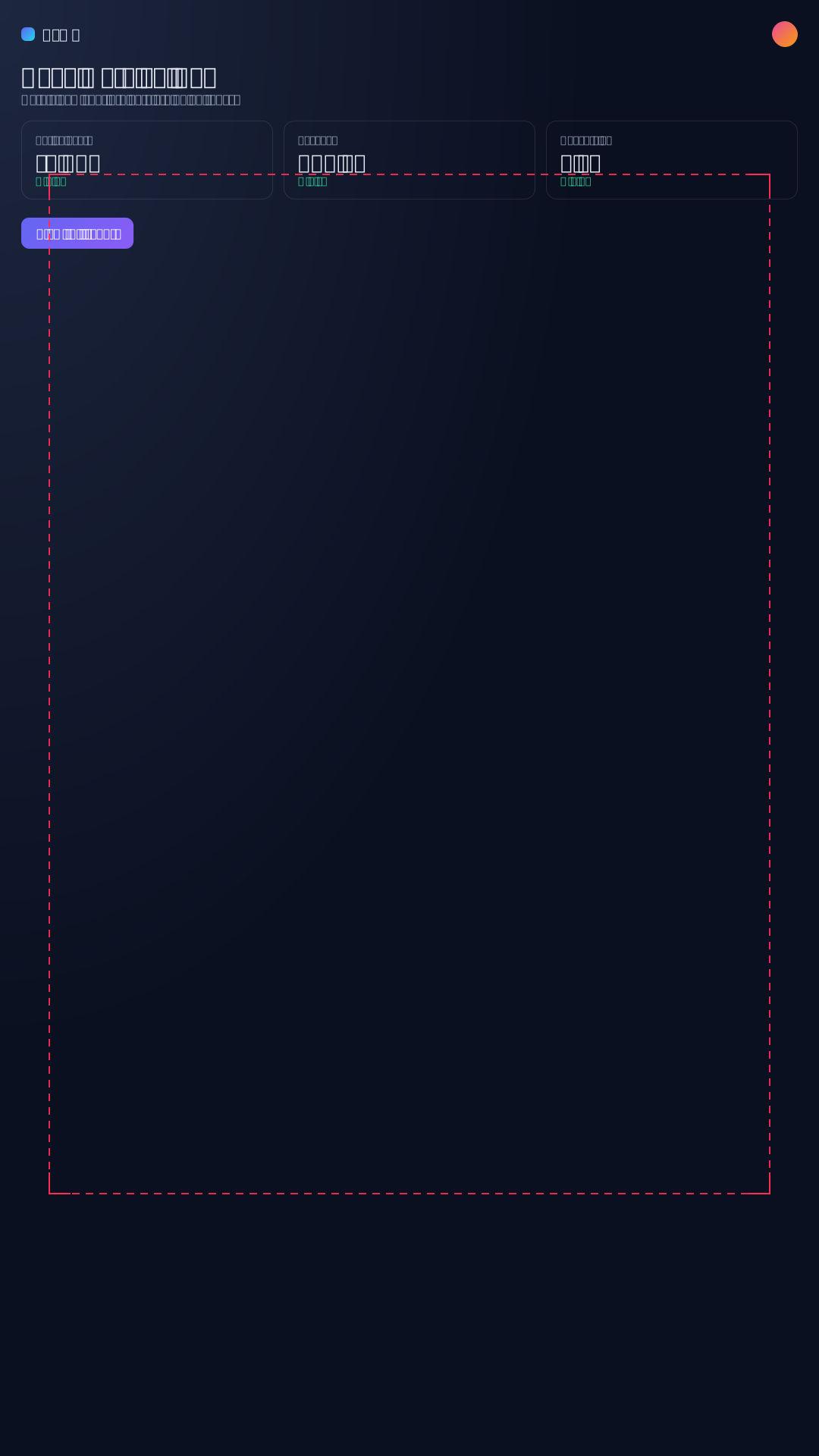
domotion capture ./app.html --format reel --safe-guide -o teaser.svgDrop --safe-guide for the clean asset, or wrap the capture in a phone with
--chrome phone. Formats: reel / story (1080×1920), square (1080×1080),
portrait (1080×1350), landscape (1920×1080), or a raw --format 1080x1350.
Then export a social MP4 with svg-to-video teaser.svg -o teaser.mp4.
2. Animate a testimonial / quote card
Section titled “2. Animate a testimonial / quote card”A pull-quote that reveals itself — no page to build. Give it the quote, an attribution, and an accent color.

domotion template quote \ --quote "It dropped our demo payload to a fraction and stays razor-sharp." \ --author "Ada Lovelace" --role "Staff Engineer" \ --accent "#8b5cf6" -o quote.svgWant it vertical for a Reel? Add --format reel — the type scales up so it reads
well on a 9:16 canvas rather than merely fitting:

domotion template quote \ --quote "This changed how our whole team ships." \ --author "Ada Lovelace" --role "Head of Engineering" \ --format reel -o quote-reel.svg3. A kinetic title over a captured screen
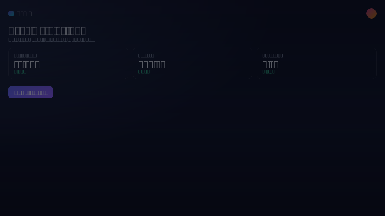
Section titled “3. A kinetic title over a captured screen”The move that motivates compositing: a real UI in the background, an animated
headline on top, all in one self-contained SVG. The background is a genuine
capture; the headline is the kinetic-text template rendered on a transparent
background so the screen shows through.
-
Capture the screen to a static SVG:
Terminal window domotion capture ./app.html --width 1280 --height 720 -o screen.svg -
Layer the headline over it with a
compositeconfig — atemplatelayer sits on top of the capturedsvglayer:title-over-screen.json {"width": 1280,"height": 720,"background": "#05060f","layers": [{ "svg": "screen.svg", "x": 0, "y": 0, "width": 1280, "height": 720 },{"template": "kinetic-text","params": {"text": "Your product,\nin motion","background": "transparent","color": "#f8fafc","fontSize": 104},"x": 0,"y": 0,"width": 1280,"height": 720}]}Terminal window domotion composite title-over-screen.json -o title-over-screen.svg
4. An on-brand chart
Section titled “4. An on-brand chart”Turn numbers into an animated chart that already matches your brand. A single
--brand file supplies the palette, font, and colors — no per-chart color flags.

domotion template chart --brand acme-brand.json \ --type column --data "42,68,55,90,34,76" \ --labels "Jan,Feb,Mar,Apr,May,Jun" --title "Signups" -o chart.svgFor a vertical feed, combine the two: --brand acme-brand.json --format reel
gives you the same on-brand chart sized for a Reel — the type and bars scale up
so it reads well at 9:16, not just fits:

The brand file is small — palette, font, radius, and an optional logo, reused across every template:
{ "palette": { "primary": "#2f6df6", "accent": "#22d3ee", "background": "#0b1020", "text": "#e6edf3", "muted": "#8b93a7" }, "font": { "family": "Inter, system-ui, sans-serif" }, "radius": 12}5. A before / after compare
Section titled “5. A before / after compare”Reveal an “after” over a “before” with a clip-wipe and a moving label — perfect
for a redesign, a refactor, or a “with vs. without” story. --before / --after
each take a page, image, or SVG.
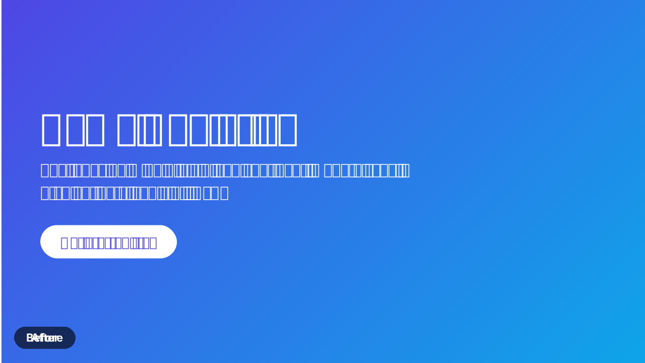
domotion template compare \ --before ./before.html --after ./after.html \ --mode slide --direction right \ --beforeLabel "Before" --afterLabel "After" -o compare.svg6. A storyboard: title → demo → CTA
Section titled “6. A storyboard: title → demo → CTA”Sequence distinct scenes into one film: an intro card, a live capture of your product, a kinetic line, and a closing call-to-action — each with its own inter-scene transition. The whole thing is still one animated SVG (and exports to MP4 unchanged).

{ "width": 960, "height": 540, "background": "#0b1020", "scenes": [ { "template": "title-card", "params": { "eyebrow": "DOMOTION", "title": "Storyboard", "subtitle": "distinct scenes into one animated SVG" }, "duration": 2600, "transition": { "type": "crossfade", "duration": 400 } }, { "capture": { "file": "app.html" }, "duration": 2000, "transition": { "type": "push-left", "duration": 450 } }, { "template": "kinetic-text", "params": { "text": "Native. Crisp. Self-contained." }, "duration": 2600, "transition": { "type": "scroll", "duration": 450 } }, { "template": "cta", "params": { "headline": "Ship it as one file", "cta": "Get started" }, "duration": 4000 } ]}domotion storyboard storyboard.json -o storyboard.svg(The committed example uses a live capture.html for scene 2 and a pre-rendered
cta SVG for the final scene; the shape above is the same runner.)
7. An animated stat callout
Section titled “7. An animated stat callout”A single KPI that counts up on an odometer reel, with a trend chip — great for a metric spotlight or a milestone post.

domotion template stat --value 1240000 --grouping \ --label "Monthly active users" --delta "12.4%" --deltaDir up -o stat.svgNeed a pure number-ticker or a countdown instead? domotion template counter
covers count-up, count-down, and timer modes.
8. A closing CTA end-card
Section titled “8. A closing CTA end-card”End the piece with a pulsing call-to-action button and your handles — an end-card you can tack onto any clip.

domotion template cta --headline "Ship your first demo today" \ --cta "Get started" --handles "@domotion,github.com/brianwestphal" \ --ctaColor "#3b82f6" --background "linear-gradient(135deg,#111827,#0b1020)" -o cta.svg9. A subscribe / follow social card
Section titled “9. A subscribe / follow social card”A pop-up “follow” card with an avatar, your handle, and a pulsing action button — drop it into a stream overlay or the end of a clip.

domotion template subscribe --name "Ada Lovelace" \ --subtitle "@ada · 89.4K followers" --action "Follow" \ --accent "#1d9bf0" --theme dark -o follow.svgSwap --action "Subscribe" and a red --accent for a YouTube-style card, or add
--brand acme-brand.json to theme it from your kit.
10. A looping-background hero
Section titled “10. A looping-background hero”A seamless, self-contained animated background — aurora, drifting orbs, a starfield, a panning gradient, a grid, or a wave — to sit behind a title or loop on a screen.

domotion template background-loop --variant aurora --seed 4 \ --width 1280 --height 720 -o hero-bg.svgVariants: aurora, orbs, stars, gradient-pan, grid, wave. The --seed
makes the (deterministic) motion reproducible.
Where to go next
Section titled “Where to go next”More templates — every built-in and every flag, each with a live example. See the Templates guide.
Ship it — where the animation plays vs. shows a static frame, and how to export an MP4/GIF/PNG per surface: Embedding & reach.
On brand everywhere — one brand file across templates and captures. See Domotion for creators.
From your real app — capture a live, stateful UI in motion: Web app demos.